How many changes have you done to your interior space during this past year? Whether it was a change of furniture layout, repainting the walls, adding more light fixtures or perhaps even removing them, after spending so much time in one place, the space you were once used to didn’t make sense anymore. We could blame the overall situation for how we’ve been feeling lately, but as a matter of fact, the interior environment plays a huge role in how we feel or behave as well. However, if you were wondering why some neighbors seem much more undisturbed and serene even in the midst of a pandemic, it could be because the interior is greener on the other side.

In previous articles, we saw how colors change the perception of interior spaces; light colors enlarge rooms, while dark colors compress spaces and make them appear smaller. This is why when designers want to convey a specific mood or create an illusion, they play around with where they place dark walls. The same applies to materials and lighting; their choice selection and placement greatly influence the way people behave within that space.
First, let’s take a look at how we perceive colors.
In theory, the human eye and brain translate the light reflected on an object into color. The retinas in our eyes have receptors that are sensitive to blue, green, and red (unrelated to the cyan, magenta, and yellow, the primary colors of the color wheel), which are responsible for the perception of color. The combinations and variation of these three colors create the visible color spectrum we are all familiar with. Then, the human brain creates a link between the color it is seeing and the context it is accustomed to see it in, influencing the psychological perception of the color. Color psychology is the study of hues and tints and their influence on human behavior. According to a study conducted by German neurologist and psychiatrist Dr. Kurt Goldstein, colors with longer wavelengths such as yellow, red, and orange are stimulating compared to those with a shorter wavelength, such as green and blue, which evoke calmness and serenity. However, the way people perceive colors differs from one another due to several factors such as cultural differences, geographic location, and age.

So what is green mostly perceived as?
“The color green may have a special connotation in terms of human evolution due to its correspondence with fertile natural surroundings where factors such as a temperate climate and the availability of food were more conducive to survival. Humans have tended to migrate toward and settle in green fertile geographic regions of the world and therefore, the propensity to experience positive moods in natural surroundings is an innate instinct in which greenness has a particular significance.” Akers, et al.

Instinctively, the human brain links the color green to nature and vegetation, and in nature, one usually finds freshness, health, and tranquility. It is the unengineered area in life that has long existed before the human race and is a vital symbol of renewal and prosperity. Many psychologists and researchers have found green to be a healing color, which is why it is commonly used in doctor’s clinics and waiting areas. Even in media studios, guests and interviewees of television shows wait in a “green room” to relieve the stress of being on air. In addition to its calming qualities, green is often linked to the “go” notion, as used and seen on traffic lights and infographics. This endorphin-releasing value provokes a call for action, as if the human is “ready to go” or is “on the right path”, which is why study areas are often painted green to provoke motivation, creativity, and imagination.

Green and Interior Design
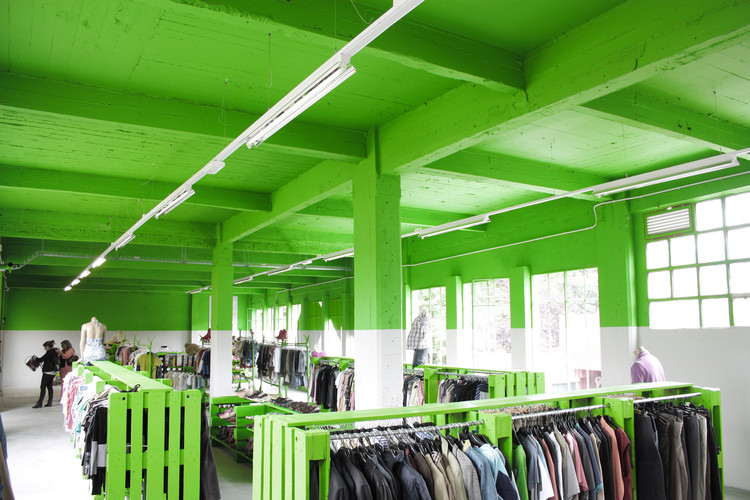
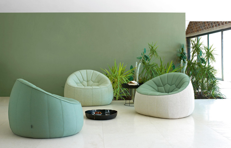
When it comes to interior spaces, designers have found several ways to utilize green. Other than painting the walls, designers have brought the outdoors inside by using biophilia as an important source of inspiration, promoting well-being, health, and emotional comfort, incorporating natural greenery within their designs.
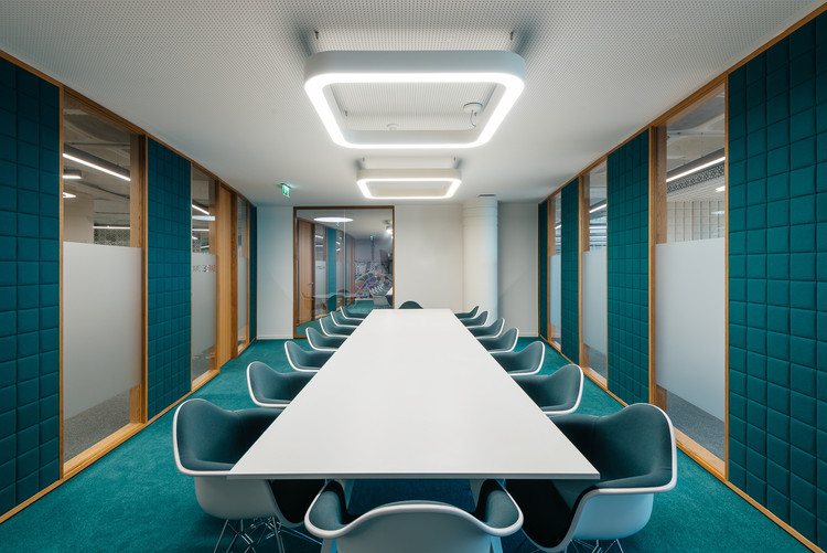
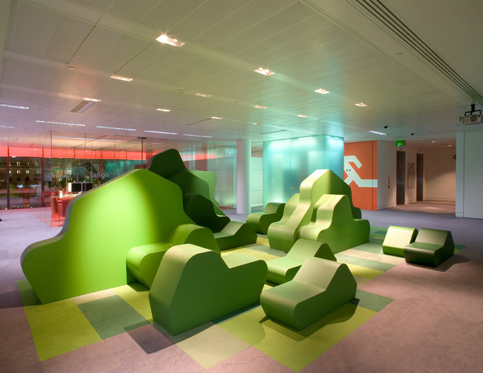
In terms of color coordination, green is a very versatile color that pairs well with neutrals like brown and gray, colors excessively found in residences and commercial spaces. Although green is considered a cool tone, its wide range of hues allows it to contrast well with warm tones like yellow and orange. After all, red and green are opposites on the color wheel so they naturally complement each other.
Take a look at how designers employed green's versatility in their interior spaces.


This article is part of the ArchDaily Topic: Green. Every month we explore a topic in-depth through articles, interviews, news, and projects. Learn more about our monthly topics. As always, at ArchDaily we welcome the contributions of our readers; if you want to submit an article or project, contact us.
References
- Color Psychology: Effects of Perceiving Color on Psychological Functioning in Humans by Andrew J. Elliot and Markus A. Maier
- The Trichromatic Theory of Color Vision by Kendra Cherry
- The Color Psychology of Green by Hailey van Braam
- Visual color perception in green Exercise: Positive effects on mood and Perceived Exertion by Akers et al.


